Bluebeam Brand Refresh
Bluebeam Software was founded in 2002 as a PDF plugin solution for the design and build industries, but rapidly grew to become a global software solution allowing users to view, markup, and collaborate on PDFs. To signal their growth and expansion into new markets, they changed their name to Bluebeam, Inc. and tasked their design team with updating their brand identity. The challenge was to reshape their identity to support global expansion without losing the unique character and market equity of Bluebeam.
MY ROLE
Research
Art direction
Design direction
Branding development
THE TEAM
Creative Direction- Jon Setzen
Animation - Ed Mann
TIMELINE
July 2016–January 2017. Launched globally (NA, UK, SE, DE, DK, AU, NZ)
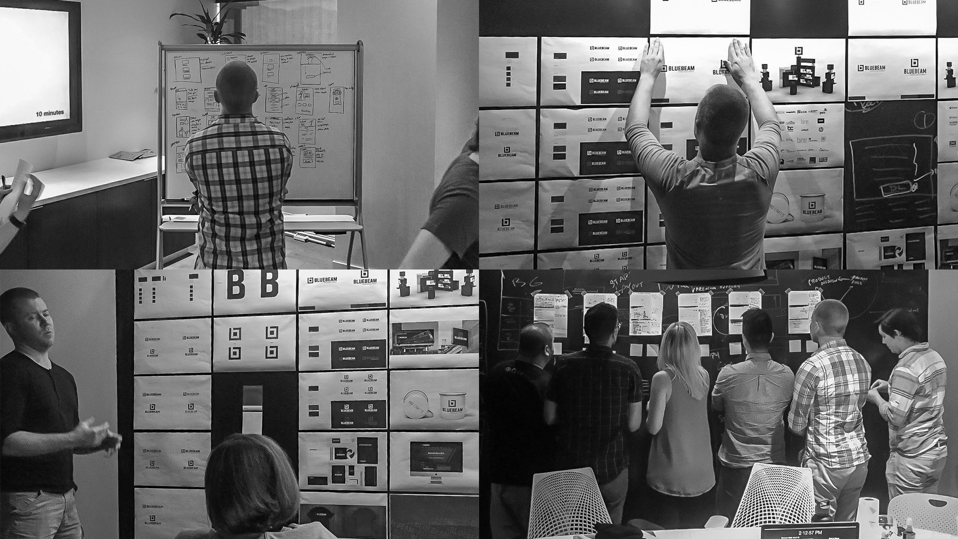
THE PROCESS
To update Bluebeam's brand identity, the team conducted discovery workshops with the leadership team, analyzed other multinational B2B and B2C brands, and performed brand touchpoint audits. The Global Creative Director and I then developed a design strategy to bring the identity to life across Bluebeam's business and partnerships.
Within the design process, I explored ways to refresh the logotype without changing the symbol to preserve its recognition and equity, and honed the brand palette to capture the approachability and reliability of Bluebeam. The goal was to create a forward-thinking expression of the brand that would remain true to its legacy.
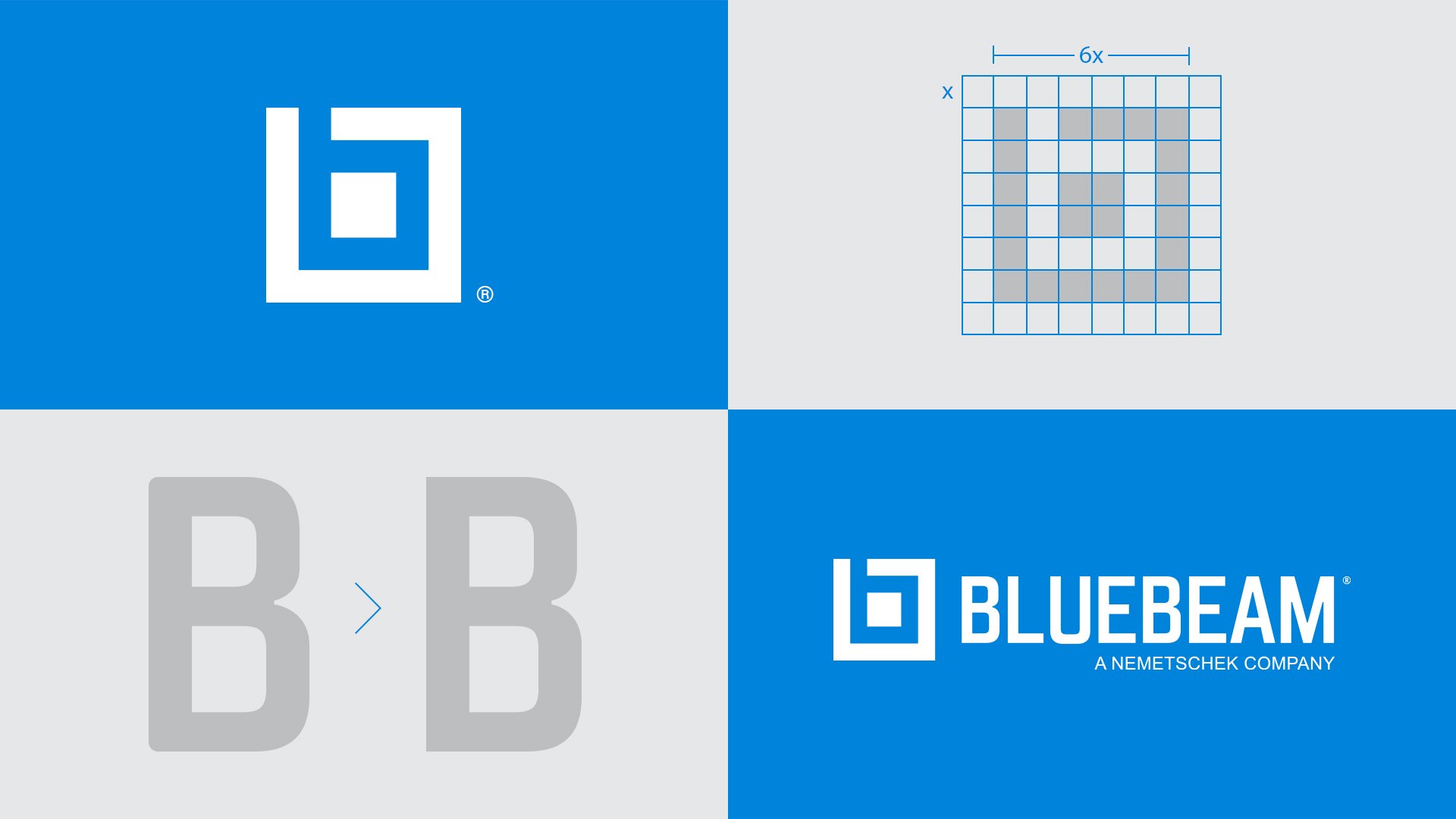
REFRESHING THE IDENTITY
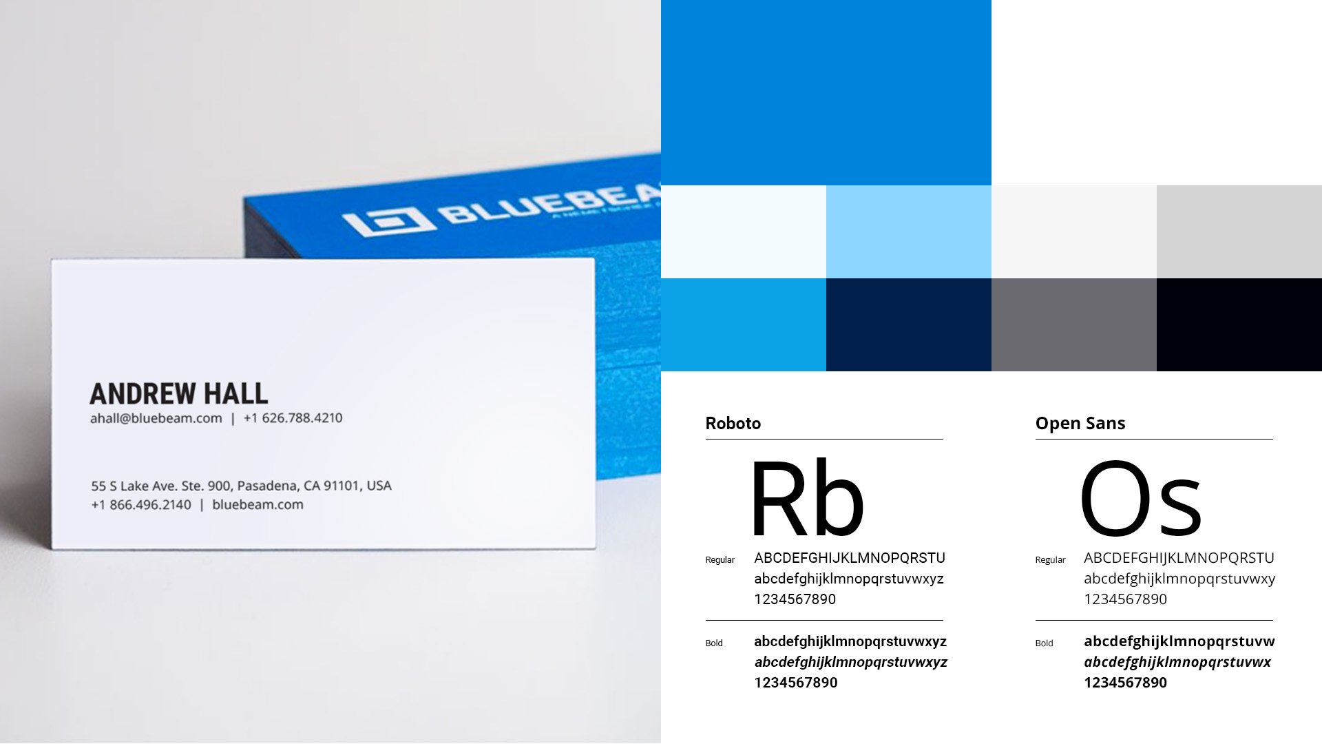
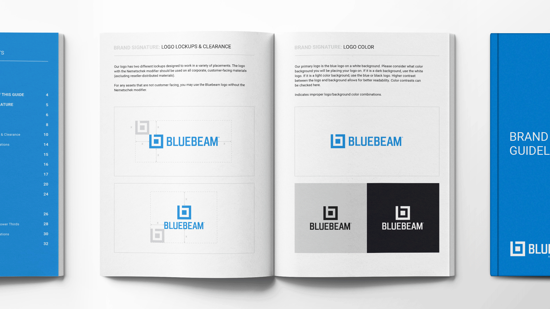
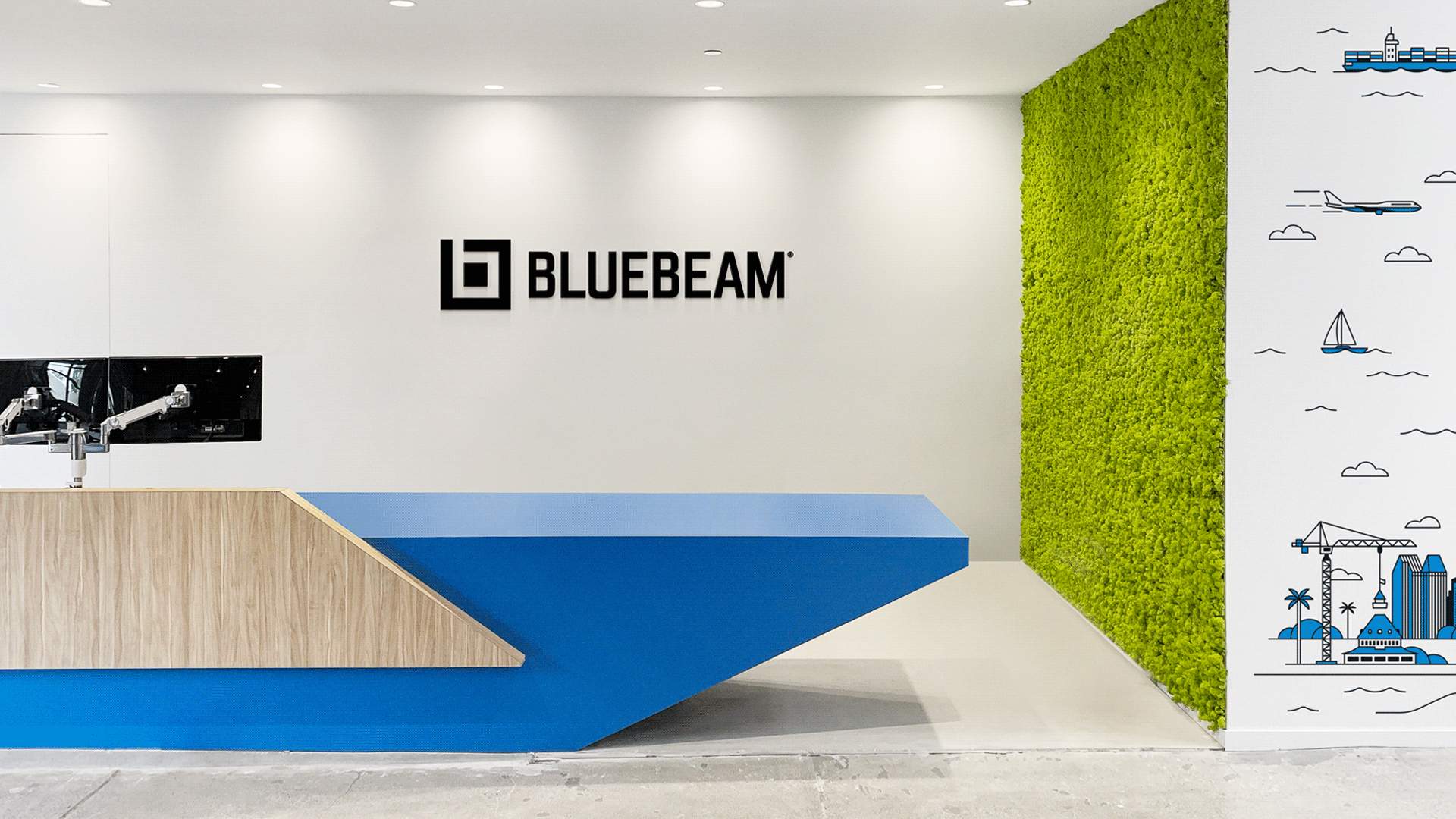
Approachability, reliability, and humanity are the core to the new logo design. The letterforms have a weight and presence that communicates the company’s maturity and relation to the construction industry. Each letter has been selectively modified in a logo that deliberately alludes to the strong foundation beneath every construction project.
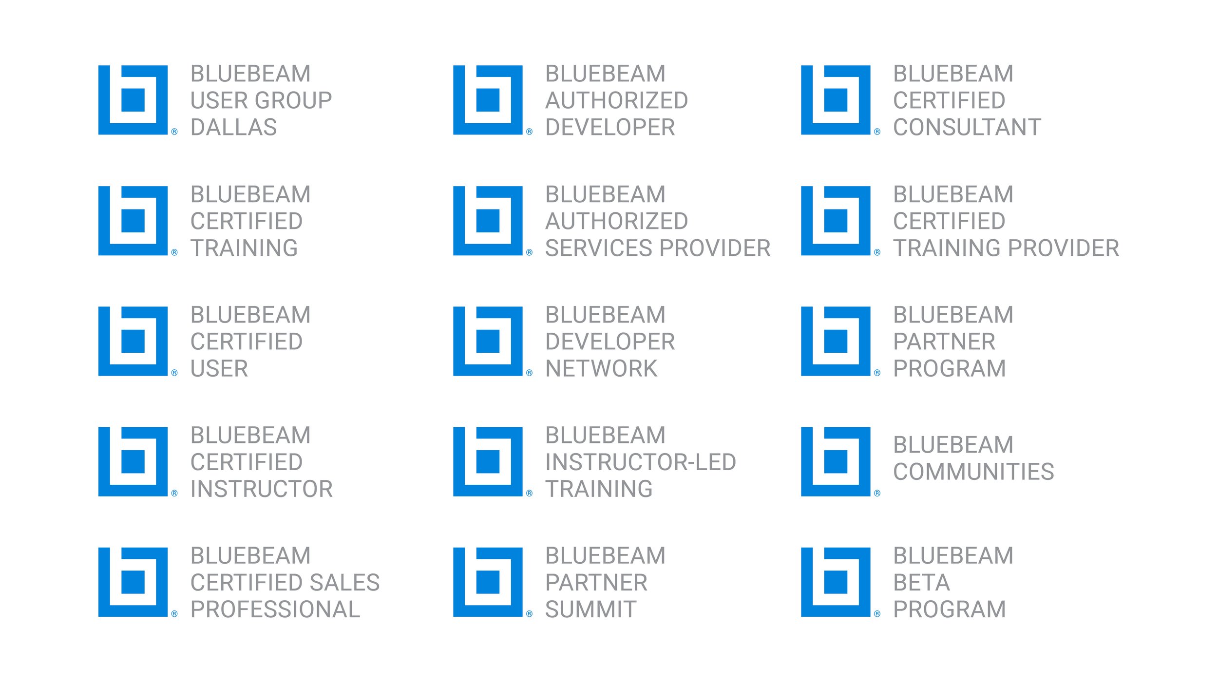
The legacy Bluebeam blue was maintained, however the palette was expanded upon to signify and align with Bluebeam's growth into global markets. The role of blue across the system was carefully considered to reinforce the brand in secondary graphic elements, photography and backgrounds. The resulting system is flexible enough for a myriad of global applications while consistently communicating the Bluebeam origins, core values and future vision.


RESULTS
The brand overhaul was a key factor in their growth and success in recent years. Since Bluebeam’s brand refresh five years ago, they have gained nearly 2 million new customers and experienced a revenue growth of over $150 million. In addition, the rebrand helped expedite the opening of Bluebeam offices in multiple cities around the globe, including Brisbane, Chicago, Copenhagen, Dallas, London, Munich, San Diego and Stockholm.